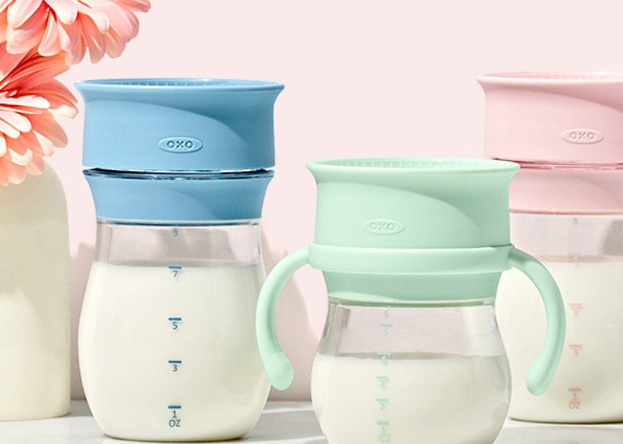
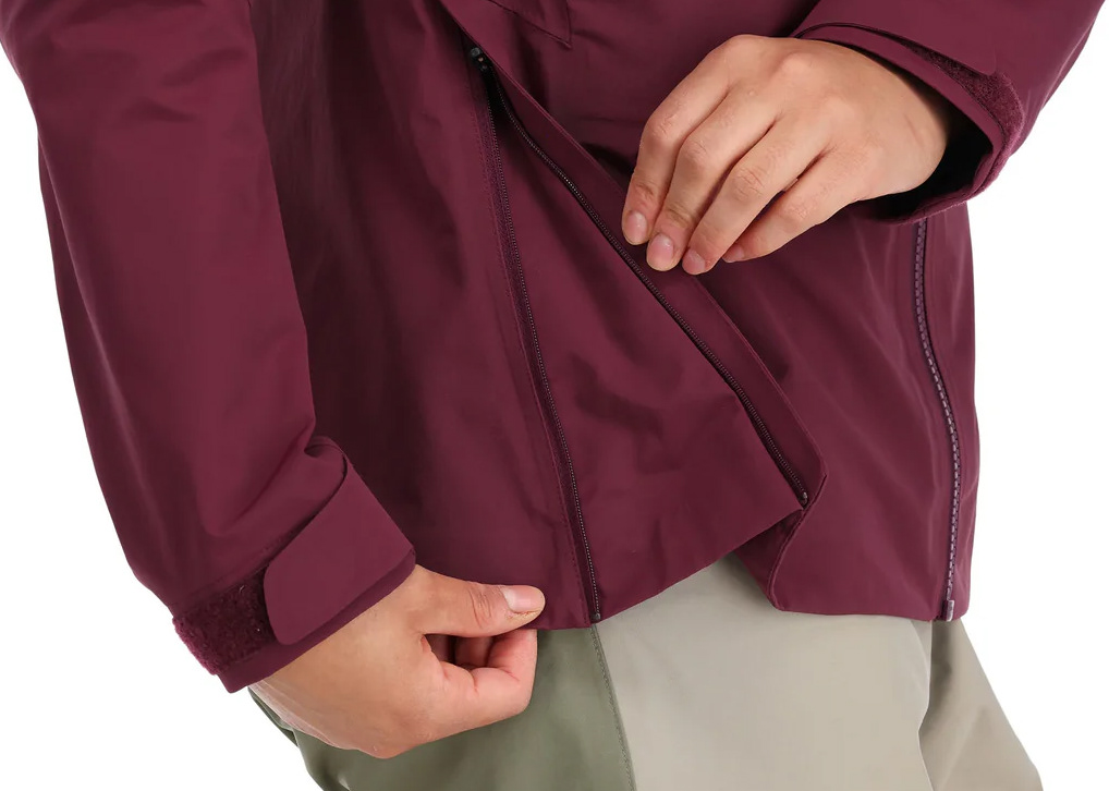
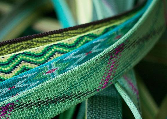
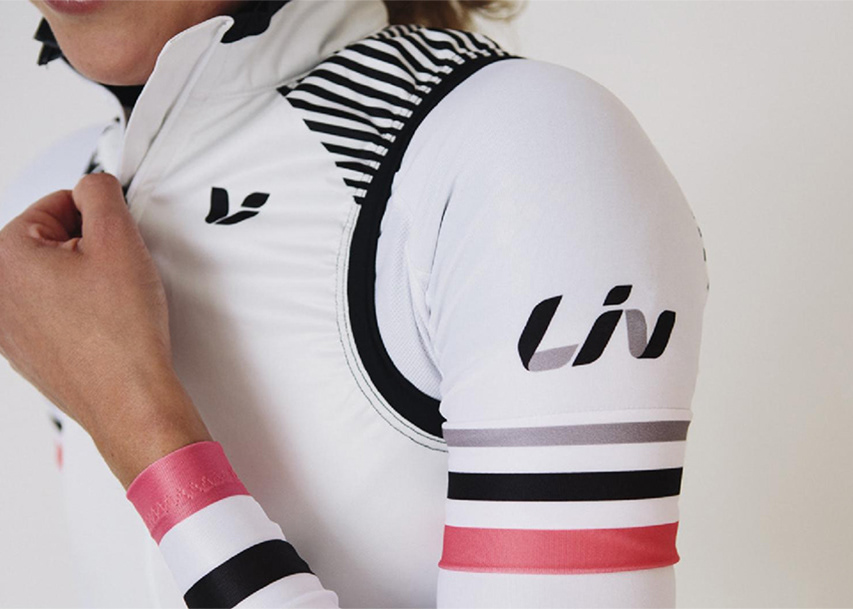
OXO is well-known for its dependable, high-quality housewares and well-loved for its modern, understandable design ethos. We have worked together on a variety of projects across OXO's product categories.
Below are photos from a few of our housewares collaborations - POP containers, bowls, Strive line, and OXO Outdoor.
POP containers are one of OXO's most popular, raved about products, but since their introduction, they have only been available in a singular colorway. I designed the limited edition Storm Blue colorway to give people a new option - one that is modern and appealing but will be relevant to interior trends for years to come.
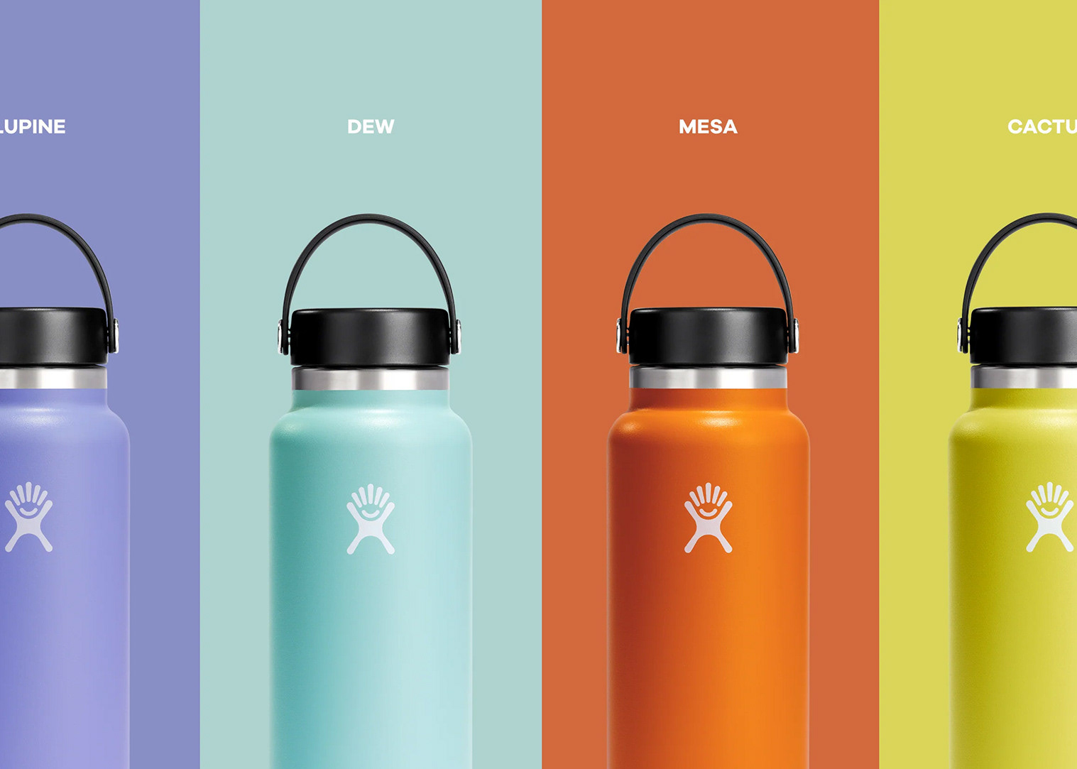
The Strive hydration line is the first time OXO has gone big with color. I got to lead the color strategy for the line. It was such a rewarding project! Here's an interview where I delve into the strategy behind the color.
OXO Outdoor is a curated collection of must-have cooking and cleaning tools for the outdoor chef, currently exclusively at REI. I designed the singular colorway that is applied across the entire line.
