
[This is from my newsletter, Creative Intelligence. Sign up here to get future issues emailed to you as soon as they come out.]
Color is a tool. It is a vital differentiator that visually captures and conveys purpose, story, and mood. When executed well, it builds a powerful affinity between a brand and its community.
So, getting color right is key.
And getting color right is not just about following and understanding color trends or selecting the precise, timely colors your customers will love. (Although these are crucial components!) It’s also about defining the structure in which those colors will operate. A beautiful, useful color strategy is created within a framework that considers and adheres to business and product logistics, capabilities, and reality.
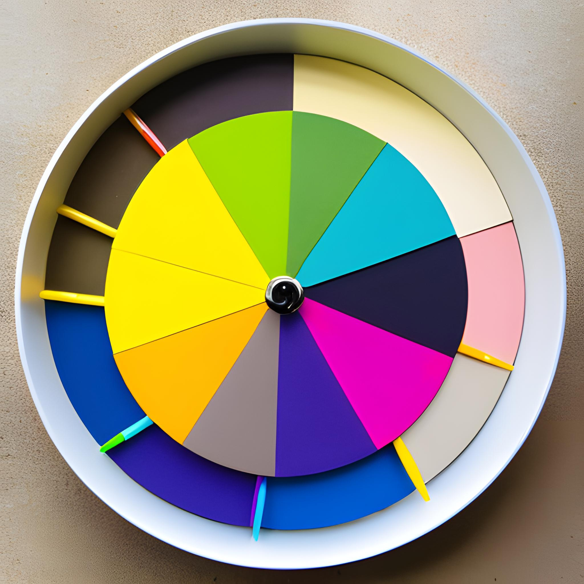
Behind every winning color strategy is a healthy dose of math.
Before your brand gets to the fun* part of color design, do your homework. Answer these seven things:
1. What does your line have the bandwidth to adopt?
First, take in the whole picture. How big is your product line and how much is changing (or do you want to change) this season? Anytime you add new color, it needs to create an intentional thread throughout your line. It needs to have muscle and presence.
If, this season, over 50% of your line will be updated - and especially if that is weighted to all/mostly carryover styles (so no new excitement other than a color refresh) - then a healthy infusion of new color in your palette makes sense. Consider a change of ~50% in your palette too. Conversely, if your line will only see a 10% color update this season, now is not the time for a complete palette overhaul.
Build the framework of your seasonal palette with this information. Use placeholders for each new color slot based on the particular goals and role of that color. Populate a line plan with the placeholders, laying (and verifying) the groundwork before you select the exact colors.
2. What does your company have the bandwidth to adopt?
There is an investment of time, energy, space, and money in color changes and color additions. What can your team realistically and successfully manage?
Great color design increases sales and profitability. But it doesn’t do this in an enthusiastic color vacuum or through sheer color volume. It does this through a mindful creation of 1) a color strategy that makes the most sense for the product line, and 2) most importantly, what makes the most sense for the long-term well-being, power, and stability of the brand and the team behind it.
3. What have you done before?
When a brand updates its palette, the change needs to be meaningful. Redundancy is not a celebrated trait. Have a clear record of the colors your brand has used historically. A one-page visual reference organized by color family can be incredibly helpful.
Look for the white space – the places in the color wheel your brand hasn’t utilized. Are there opportunities here that make sense for your consumer, your brand personality, and the trends you’re tracking?
Your brand will likely have concentrated areas where certain color families and tones are highly successful. Fantastic – you know what works well and sells well for you. When you draw from these concentrated areas, some general rules of thumb – 1) Have a gap of at least a year, preferably 3+, between similar colors, and 2) Make any new color at least 10% different than any previous color or bring back the previous color.
4. What colors in your current palette will carryover?
New color additions need to merchandise with carryover colors. They need to evolve and support the visual vibe of your brand, not be a record scratch. When you begin a season by determining which current colors will carry forward, you have a solid understanding of where there are opportunities for new.
If, for example, your current range of blues is crushing it and will uphold its relevancy, keep it. Don’t dilute it by adding competing new blues with the same jobs. Explore other color family additions that work dynamically with the carryover blues in a refreshing way for the new season.
5. What products and styles will get new color from this palette?
Look at your line plan. What new styles are being introduced this season? What current products are getting new colorways this season? All new additions to the color palette need to be tailored to these areas. They create the guardrails for your seasonal color adds. New colors (and colorways) must make sense for these products – their end use, their material make-up (and how color translates to those materials), their targeted consumer, their cost, and their lifespan.
6. What other products will these new styles and colorways be merchandised with and used with?
This builds on the last point. New color options should be narrowed to only colors that work well with the existing colorways of coordinating products.
For example, say a gear brand updates all their sleeping bag colorways one year. The next year, they introduce camping pillows and new sleeping pads. The pillows and pads need to be in colorways that coordinate intuitively and powerfully with the sleeping bags. It makes sense. It makes sales.
7. How long will new colors/colorways need to stay?
This is critical information to know ahead of choosing particular colors or colorways. If the investment into new color or the placement of new colorways dictates a longevity of multiple years or, alternatively, just a season, this heavily influences the amount of risk you can take in your color selection.
[* I love math so I find this part incredibly satisfying too. Fist bump to my fellow puzzle solvers and organization nerds.]