
[This is from my newsletter, Creative Intelligence. Sign up here to get future issues emailed to you as soon as they come out.]
Today, we’ll unpack the main components of a color palette. Designing a workable, successful color palette is more than putting together colors that you like. It is the thoughtful selection and combination of key color groupings – core, directional, and progressive – that together create the ideal function and impact your brand wants.
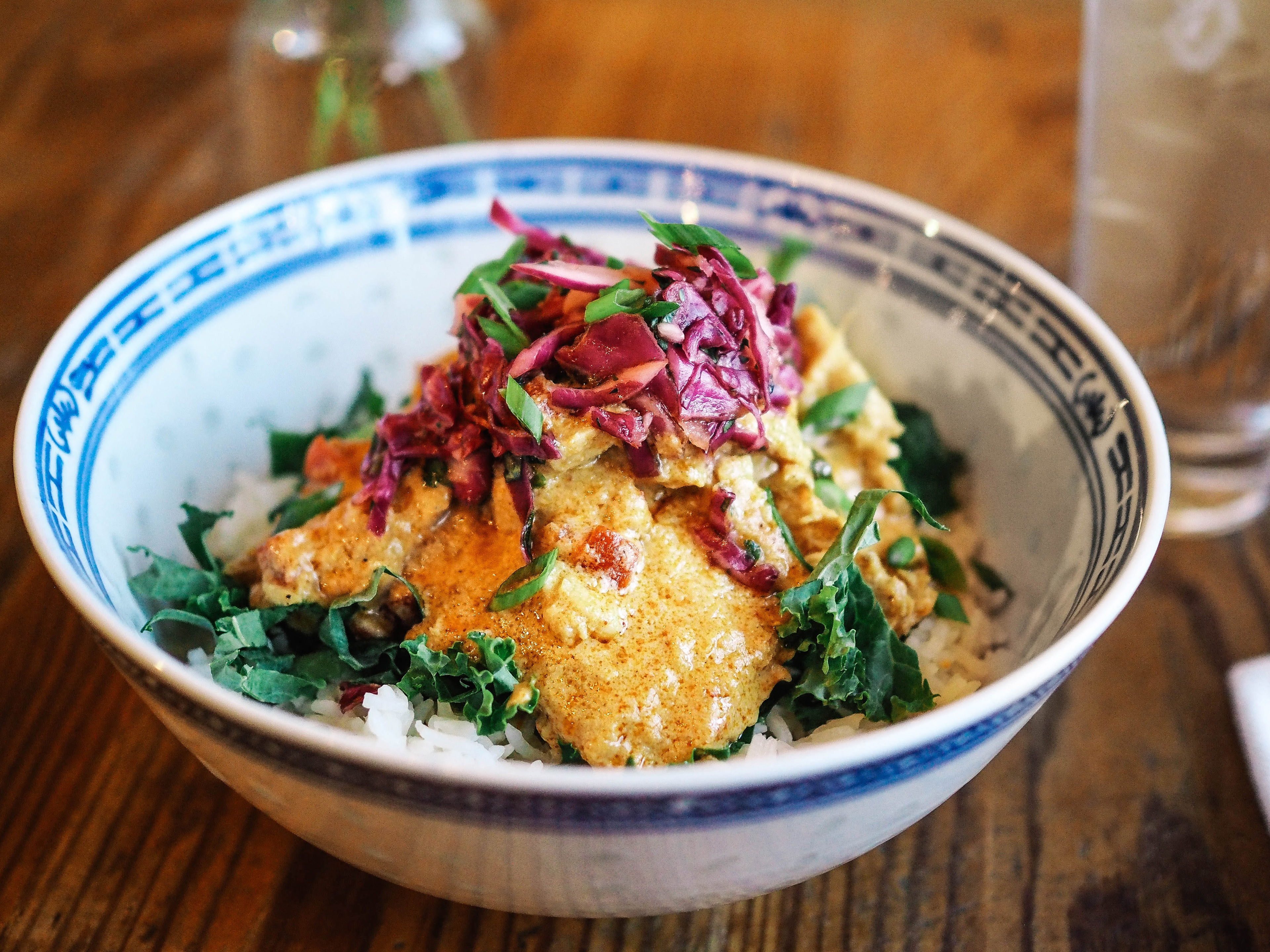
With my clients, I love to use the analogy of building the most delicious, balanced rice bowl to describe color palette construction, as it breaks down what can be intimidating into an understandable experience. Here are the details:
Core colors
Rice represents your core colors. Just as rice is the foundational ingredient in a rice bowl, core colors are the essential building blocks of your palette. These should be reliable, understandable colors that you can invest in. Don’t overcomplicate this section of your palette. Make it strong; make it make sense.
Core colors need to have long life-spans, wide-range appeal, and be merchandising heavy hitters. Keep the tones pure versus nuanced so that these staples can be color champions – meaning they partner well with multiple color families across your palette (even as it evolves year over year) and they translate consistently across products and materials. Provide a solid range of warm and cool tones, applicable for your consumer, your products, your industry.
Certainly, your core colors can reflect your brand’s unique POV. You are not limited to white rice. Go brown, go wild. Do quinoa instead. Just pick your lane, keep it simple and beautifully executed. This is where you show your consumers dependability and steady skill. Wow with unembellished excellence. Perfectly cooked rice, even when stunningly delicious, maintains an element of the expected.
Directional colors
Directional colors make your palette a meal. They invite and delight. They capture the personality of your company, reflecting its vibe, heart, and individuality. As modern, brand-attuned storytellers, directional colors create the meat of a palette. They equate to the main sustenance in a rice bowl. They are what give your color strategy muscle and flavor.
And they are where your palette should shine.
Directional colors define what you are known for and known as. They define your audience and your relevance. They intuitively evolve to respond to consumers changing tastes and needs. These colors visually communicate the ethos of your brand – what it honors, who it is for, what its purpose is, why it matters. Done well, this is what keeps consumers lining up, talking, and coming back.
Beef, fish, tofu, beans, veg – you decide. But be deliberate, be particular, be confident in your selection. Allow these colors to be complex, unanticipated, compelling. Each needs to be strong on its own and create an energy with the others. Typically, directional colors stay in a palette for 1-2 years. Always, they showcase your culture and specialty.
Progressive colors
Progressive colors bring the excitement. They are seasonal, trend-forward colors that add lively dimension and spice to a brand’s palette. Equivalent to the array of accoutrements that can top a rice bowl, progressive colors are your secret sauce. They highlight the very specific space, at a very specific time, where your brand and your consumers connect most intensely. They are experimental, calculated additions that bring flare. The progressive colors you choose each season sharpen your brand’s voice – honing the vision and value consumers will recognize you for.
Most likely, progressive colors will not be your steady sales drivers. They are more apt to fall on one side of the sales bell curve. Obviously, the goal is to have them crush it (the color counterpart to the put-an-egg-on-it culinary trend), but that is not the only goal. Progressive colors keep your brand fresh and on-point. They follow the innate fancy of your consumers, continuously renewing and invigorating your relationship with them. Their strength is to enthusiastically attract people to your brand, even if those people end up purchasing a different color. Progressive colors have the most potential for drawing consumers in.
Be judicious but not stingy when selecting progressive colors. Keep their quantity tight. Ensure they are distinct from past seasons and work well with at least a strong subset of your larger palette. Keep them for a season or two.