
[This is from my newsletter, Creative Intelligence. Sign up here to get future issues emailed to you as soon as they come out.]
In the last issue, we talked about how brands can approach design now, in 2024, to guarantee a positive 2025/2026+ product season. In this issue, we’ll extend that conversation into the realm of color.
Many brands are coming off of a challenging year. Or, probably more realistically, several challenging years. As we move into 2024, there is a sense of cautious optimism. It’s fueled by more promising than expected economic news, but also from hard-won lessons learned negotiating the chaotic uncertainty of the last several seasons.
Even though businesses may feel a sense of hope, many are still navigating from a place of limited resources and smartly wary of how soon things will solidly improve - for themselves, their audience, and the world at large.
Still, if brands want to be relevant - much less thrive - in the future, they need to innovate and plan well now. This requires much more care and expertise in today’s precarious climate. Brands don’t have the budget or the tolerance to miss the mark, nor does their audience have the patience if they do.
So, given this, how should a brand approach color planning and strategy in 2024 in order to be successful 1-2+ years in the future when the color launches?
Here is my advice.
First, let’s look at big picture color strategy suggestions, and then, color category specific recommendations.

image: Alberto Bobbera
Big picture color strategy suggestions:
1. Define your brand’s goals for the future, both the necessary and the ideal. Your color strategy needs to be built to support these goals. Every color your brand uses must have a specific purpose(s) that directly ties to your key goals. Why? Color viscerally and immediately communicates a brand’s values, personality, and community culture. It dominates people’s impressions of a product or experience. Color makes products sell and makes brands noteworthy.
2. Tighten your color palette. Likely, you don’t have the budget or bandwidth to go deep in color, so make sure you nail a solid, condensed yet comprehensive palette. All colors need to be sellable; they need to balance or exceed the investment required to adopt them. Given the reduced quantity, they will likely need to accomplish multiple “jobs” that support your brand’s future goals. Make sure they do so.
3. Make it special. Just like we talked about in the last issue regarding design, your color needs to be unique. Now is not the time to be ho-hum or do what everyone else is doing. People want to align with brands that have a POV, that stand for something, that share their values; all of which can be highlighted in the way a brand uses and is recognized for using color.
4. In tandem with all of the above, streamline your line. Cut what isn’t working. We talked about this from a design perspective last issue. Narrow down your products and colors to what is distinctive, sells, and makes sense for your brand’s vision. When you make your line easy to understand and shop, you are able to tell cohesive color stories that support product stories that support your brand story.
5. Be realistic from the beginning. At the start of the color process, determine how many colors you can change and add. Don’t be hopeful, be real. This year especially, you need every single color to matter. If you are too optimistic at the beginning, you will end up having to cut color(s) further into the process that were a key part of your brand’s strategy and success. Your line will be fragmented and lackluster.
6. Acknowledge the hiccups. This will not be a perfect process. Colors that aren’t great may need to carryover. You may not be able to introduce as many new colors as you want. There may be disjointed product colorways in your line that have to remain for another season. Do the best you can. Use the flexibility that you do have to integrate these bumps into a smooth vision.
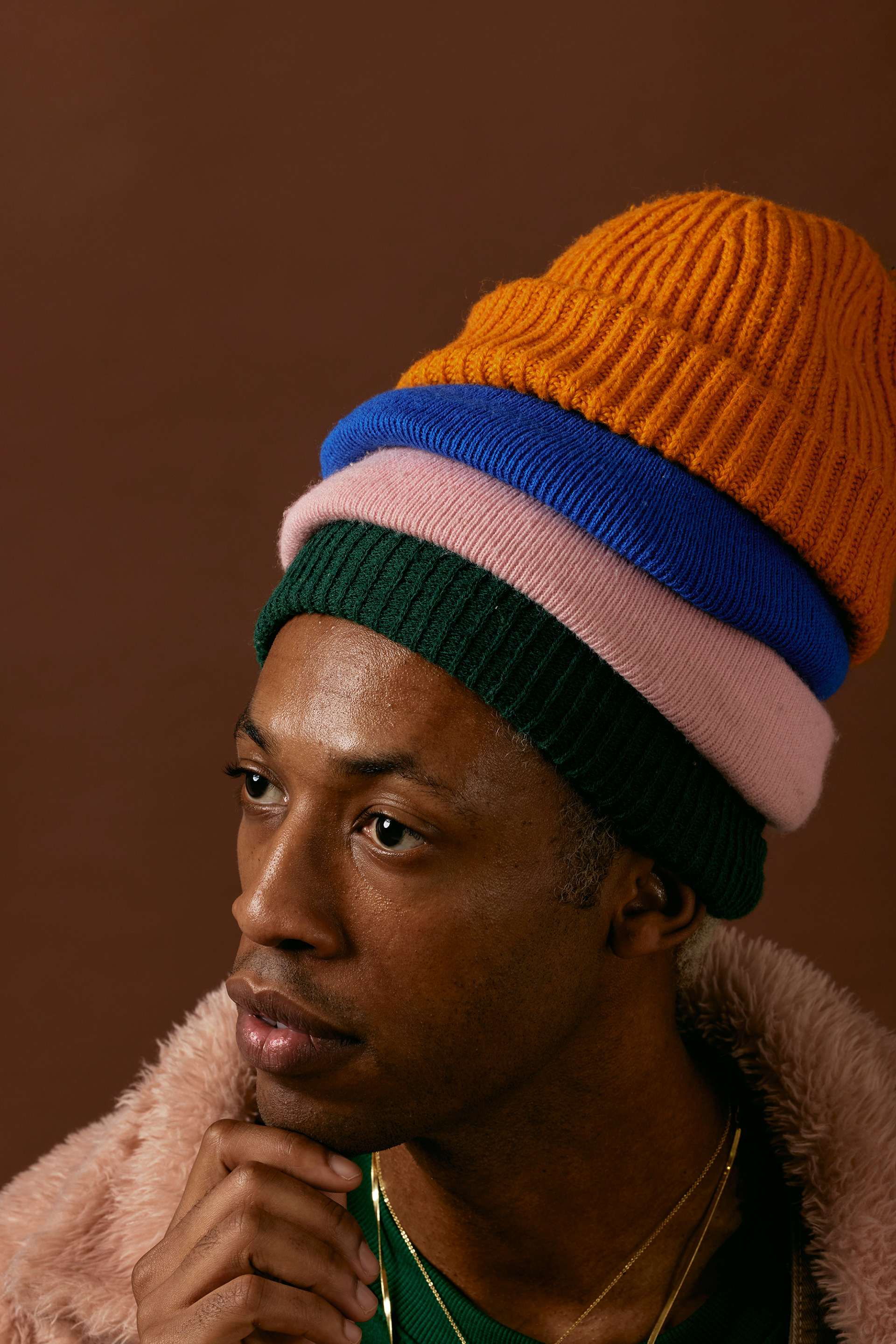
image: Natalia Blauth
When it comes to specific color categories, these are my recommendations:
1. Nail your directional colors.
This is the key color area to get right for the future success of your brand.
Directional colors capture the heart of your brand. They spotlight its personality and culture, typically remain in the palette for several seasons or 1-2 years, and can account for 40-80% of your brand’s colors. Directional colors are the bridge between more foundational core colors and quicker-turning progressive colors. Ideally, you want these colors to rotate in and out of the palette in an off-set cadence, creating an ever-inspiring, fluid evolution season to season.
Directional colors are always important, but especially so now. Why? People are seeking newness; they are bored by a sea of sameness. The last several years have weighed heavily on their psyches and ambitions. They crave uniqueness in experiences, products, and colors to infuse their lives with a creative expression of who they are and what matters to them. More conscientious of consumption, they are curating their spaces, their lives, and their attachments (physical, social, emotional) to what truly brings them pleasure, growth, or peace.
You want to mirror this in your brand’s color palette. Allow your directional colors to amplify your brand’s values and vibe, to show what makes it different, how it understands and celebrates the shared community between you and your audience. People have high expectations. These colors are for folks that don’t want the basics or the colors that they can get from anyone; they want a color that is meaningful to them and that they will love for a long time.
Likely, you will need to keep the quantity of directional colors narrow right now because of resource concerns. That is fine, and frankly ideal, even in the best of times. This should be a thoughtful assortment of colors, where each color has a specific purpose and contributes uniquely to the collective energy.
2. Dial in core colors and neutrals.
These colors should be understandable, essential basics. They should make sense for your audience and industry, translate well across all the materials in your products, and have a lifespan of 5+ years. If you already have core colors and neutrals, they perform well, and you believe they will continue to do so, keep them.
Why are core colors so important to get right, right now? People continue to grow more mindful of their purchases. These colors give cost-conscious, sustainably-minded people a trusted option. They also give brands (and retailers) a safe place to invest in materials and inventory, providing overall cost savings and avoiding promotional environments down the line.
With the boundaries between spaces and activities in people’s lives becoming more fluid, core colors and neutrals become more appealing to many. They easily transition from one place to another, one mood to another, without adding visual noise or seeming out of place.
I would make sure that you offer all of your products in at least 1 core colorway or neutral, but, depending on the product line as well as your brand’s bandwidth and risk tolerance right now, you could increase that to 50% or more. The closer your brand is to survival mode, the more your colors should skew towards core. Obviously, by their very nature, core colors and neutrals won’t magnify your brand’s unique POV, but they will provide solid ground in the meantime. If you do rely on them heavily for the seasons ahead, consider using other ways to meaningfully engage with your audience.
3. Mindfully consider progressive colors.
Including progressive colors, and the quantity of them, will be very brand and market driven right now.
Progressive colors are trend-forward, seasonal colors. They capture a specific moment or feeling in time. They are exciting, evocative, and have the potential to elevate a brand’s status to color and cultural leader. While progressive colors can be risky or polarizing, they give brands the opportunity to powerfully highlight their ethos and enthusiastically attract both their loyal followers as well as new people to their brand.
Progressive colors will matter more to certain industries and brands than others. If you are resource strapped, or if your products or market have longer lifecycles or a more modern, less trendy, mindset, consider skipping progressive colors for now. You could also choose to bring them in as DTC or limited editions, perhaps making the investment less and extending the timing of the decision.
If you do incorporate progressive colors into your palette, make them uber particular to your community. Make them amazing. People are very particular now and have a lot of competition for their attention; give them a compelling reason to notice and choose what you are offering. Use these colors to make them feel like they belong to something special.
Put progressive colors in key selling and pinnacle products. Only use as many as your line can support. Likely, they will not be more than 10% of your palette right now. They may just be 1-2 colors.
It is a tricky time right now. I hope this helps!