[This is from my newsletter, Creative Intelligence. Sign up here to get future issues emailed to you as soon as they come out.]
I was recently reminded that color can mess up the functionality of a product just as easily as it can benefit it.
My family loves to ski. We’ve been having an amazing snow year here in Central Oregon. It came early and strong. It has been fantastic.
It’s also been fairly stormy. Which is great for free refills, but sometimes challenging for visibility.
A few weeks ago, we had a string of days with rimy conditions, flat light, and strong winds that created a variable, chunky snow surface. Not uncommon here, but felt a little extra this year. I’ve got a great pair of photochromic goggles that I dig, but they don’t have a wide enough range to be helpful in super low light. I felt like I was skiing blind. Luckily, I know our mountain well enough to anticipate the contours but I was still having some surprising - and slow, so cautiously slow - moments.
It wasn’t as fun as it could be.
Meanwhile, my husband, Rob, was (true to form) having a blast. He was having no issues seeing. Our son, Max, was in a similar camp to me - could barely see.
All in different goggle brands, we stopped to compare. Rob’s were clearly magic, whereas Max’s and mine were not. Which meant, Rob gave Max his to wear for the day and wore some plain, old glasses he had in the car (parenthood, right?). And I decided I would buy a pair of magic goggles at the mountain ski shop, where Rob got his a couple years ago.
Pickings were slim at the shop, but they still carried the model Rob has. I had hoped to get a pair of stealth, all black goggles exactly like Rob’s, but the shop only had one colorway still in stock: deep emerald with bright coral. I cringed, personally and professionally. I am not a fan of this color combo, and less so given the way this was blocked - deep emerald webbing and coordinating balaclava with hits of bright coral everywhere a pop was possible, including outlining the entire lens.
But the goggles fit great with my helmet; the lens was a magic vision portal as Rob’s experience proved. And, at least I wouldn’t see the colorway while I was using it, and I probably wouldn’t have any professional interactions on the mountain where my color acumen would be brought into question. I handed over my credit card as the salesperson reminded me there are no returns.
I was so ready to shred.
We rode the lift up, stoked and now adequately prepared for the current conditions (except Rob’s newly exposed upper face). I was giddy about how I could see.
We skied off the lift and started zooming. I could now see where there were small areas of ice (made sense given the recent weather), and turned to avoid them, zipping down the hill. Yeah! But then, a few times, I just skied straight through them, and I realized they weren’t ice; they were pillowy, perfect snow.
At the same time, I became acutely aware of these horizontal lines in my field of vision that differed in tone and were not going away. Maybe I forgot to take off an interior protective film?
I stopped to check. Nope, no film. I held up the goggles to check for any weird warping. Nope. Sans goggles, I looked around at the snow. No icy areas, at least in the area around me now.
I got a bad feeling. Something was off.
I put the goggles back on, tilting and turning my head. There was a really disorienting striping or blocking effect happening, depending on how the light hit the lens. It made the snow surface texture hard to judge. Maybe this was just something that I would get used to, that my brain would start filtering out after a couple runs? I mean, please, because I just spent a lot of money on these and couldn’t return them.
I skied down to Rob to ask if he had experienced something similar. Nope. Crystal clear vision from the start. He tried on my goggles. The verdict, “that’s weird.”
Yep.
And what was the one difference between our goggles?
The color.
The color of my goggles was screwing up their functionality, and making them most decidedly unmagic.
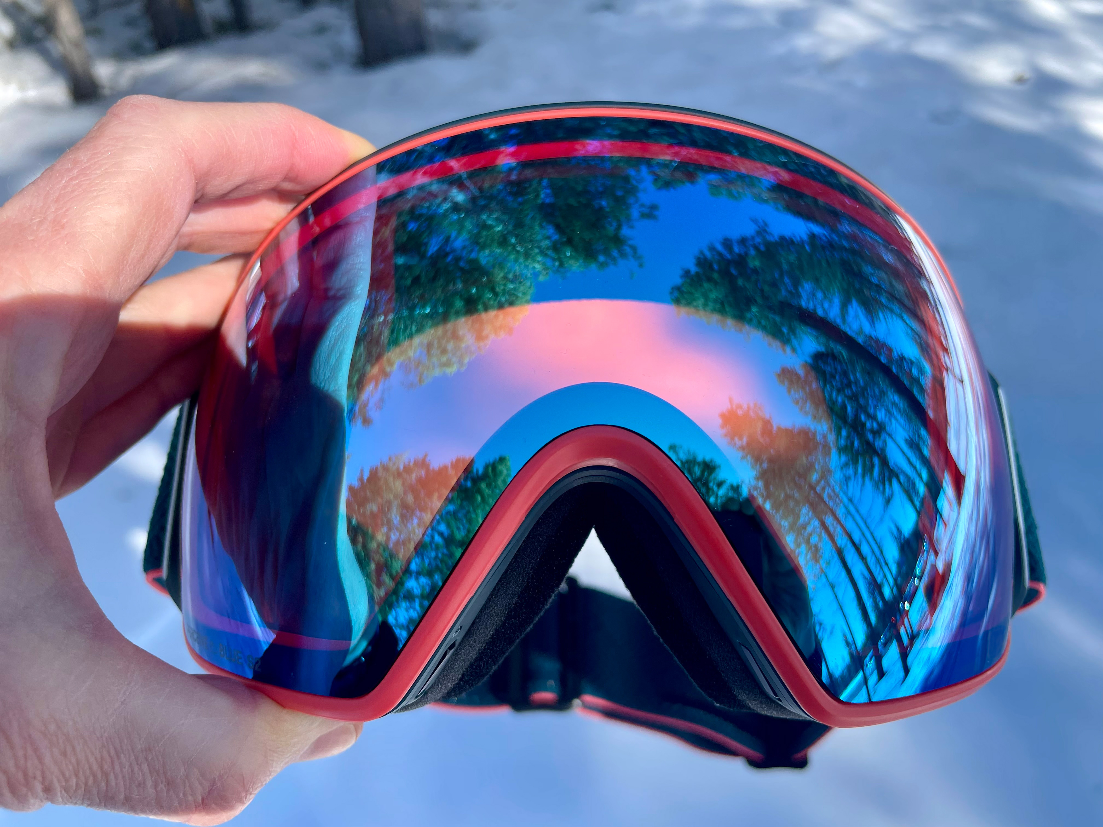
the offender
I kept skiing, hoping it was something that would work itself out somehow, that I would just stop noticing. (Yes, in other words, in denial.) No luck.
What I did get clear on was what exactly was happening - how the color was distorting the view. Where the coral was reflected in the lens, that area was like looking through rose-colored glasses. The view was warm and crisp; what you would expect from a low-light, yellow or rose lens.
By contrast, in the remaining areas of the lens, the view was bluer, which on snow, made the terrain look icy or rigid, like something to avoid.
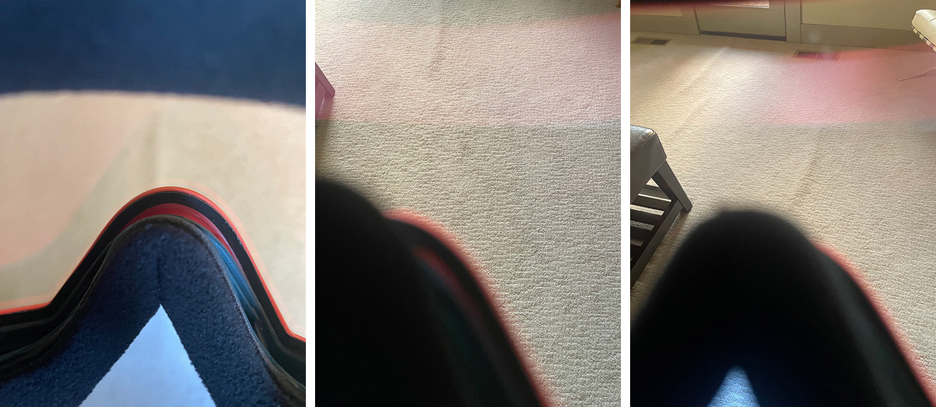
the issue, as seen in the wild, carpeted indoors
Plus, there was that weird striping or blocking depending on the angle of light. Which added up to a super disorienting and not at all pleasant experience. As a result, I was skiing like a baby deer. I do not want or tend to ski like a baby deer.
The choice of a colored lens edge - likely a purely aesthetically-driven decision by the brand to offer a more progressive colorway - ruined the goggles’ functionality. It wrecked my ski day. (And my next ski day, when I optimistically thought a different day and different conditions would miraculously equate to a different experience. Sadly, no.)
So what’s the lesson here?
Color has power. Power to add incredible value, and power to render something worthless.
To get color right, you need to evaluate its entire sphere of influence. You can not focus solely on color’s emotional and psychological benefits and disregard the impacts of its practical and physical attributes. Great color strategy looks at the whole picture - from the holistic, grand view to the unsexy, nuts and bolts specifics.
Color is, absolutely, about elevating brand recognition, building emotional connection, telling stories, and visually communicating values and personality. It is a wizard at all of these.
But color also has a HUGE impact on usability, functionality, safety, and visibility. This can not be ignored. So many brands focus on the softer, more fun and creative side of color, and neglect this.
Color strategy is not just about making something look good - it’s about making something look good and work well.
Make sure color is always working for you, in every single aspect.
Don’t ruin your customer’s day (or loyalty) by doing a half-assed job.
P.S. Anyone want a good deal on a gently used pair of goggles?