[This is from my newsletter, Creative Intelligence. Sign up here to get future issues emailed to you as soon as they come out.]
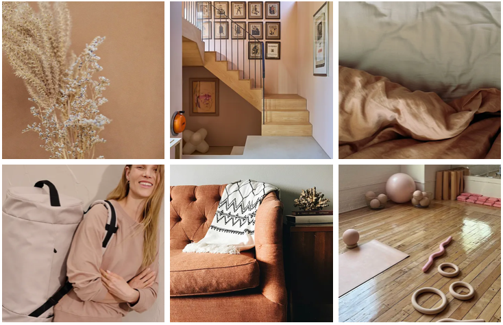
Neutrals and quiet colors have been rising in significance for the last few seasons. Now a key color trend, these hues are expected to gain prevalence and favor as we look to the future.
Neutrals + Quiet Colors
The most important trait of these neutrals and quiet colors is that they have a softened, comforting quality. They are faded, dialed down, organic; none are highly saturated or bright.
These trending hues have longevity. They are colors that easily transition from space to space, season to season, use to use, even user to user. They are not basic, but are infinitely easy to incorporate into people’s lives and surroundings. They have a warm, comforting presence. A timeless, effortless vibe.
The organic quality of these colors connects them to sustainability and calls to mind the restorative qualities of nature and calm. They are not stark or perfect colors - no pure white or absolute 50% gray - but rather, nuanced, interesting. There is a sense of some of these colors being created by recycling other colors. Hues aren’t necessarily easily defined by one color family, but rather a mix. Despite their ease of use, the colors have a sophisticated new complexity that hasn't typically been associated with neutrals or subdued hues before.
clockwise: PEdALED, Kasia Sikorska, Girlfriend Collective, Charlotte Taylor, Olderbrother, Veilance
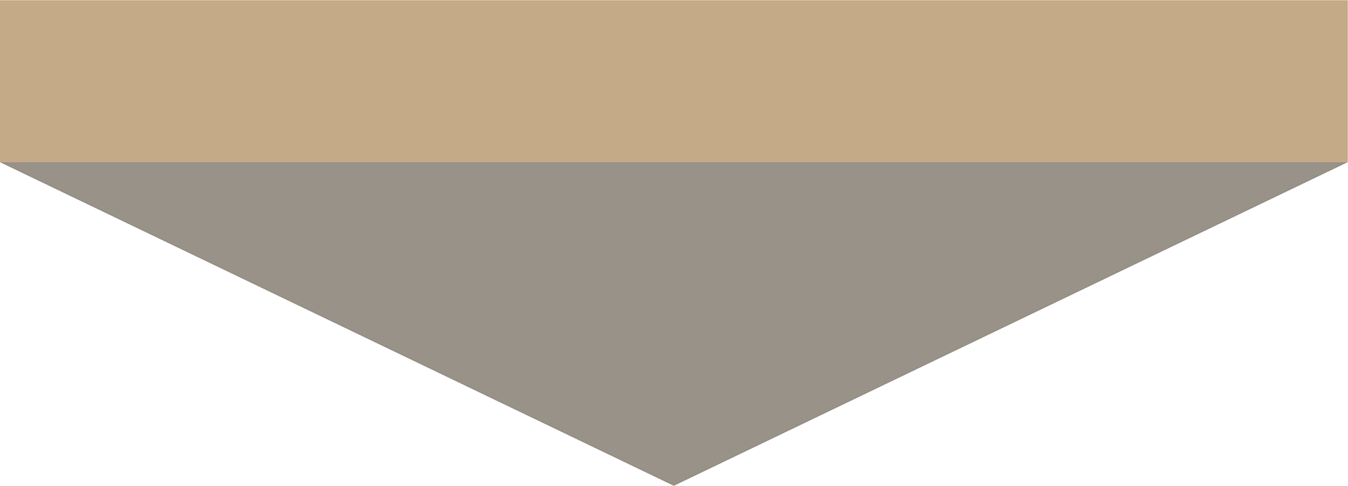
The neutrals tend to the warmer side. Grays have body and lack coldness. Whites and off-whites have an unbleached quality. Warm neutrals range from a step away from gray to camel and bronze tones, evoking a sense of artisan craft and heritage. Neutrals can also have an undertone of another color - for example, a purple-tinged gray like a peppercorn.
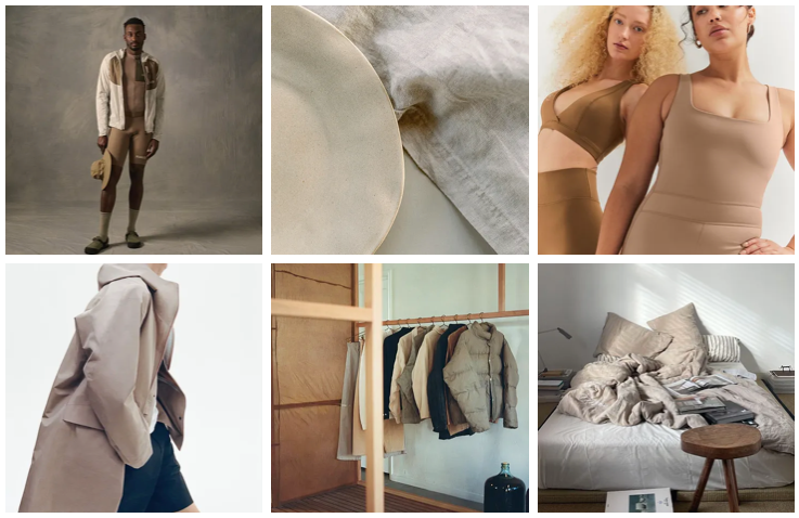
The quiet colors are muted interpretations of well-loved, trusted colors. Blues and greens especially. The quiet blues are staples of classics - faded demin, soft sky, slate, the various colors of fog and water.
clockwise: and wander, On x Loewe, District Vision x New Balance, Anthony Lee, CrowN, Satisfy Running
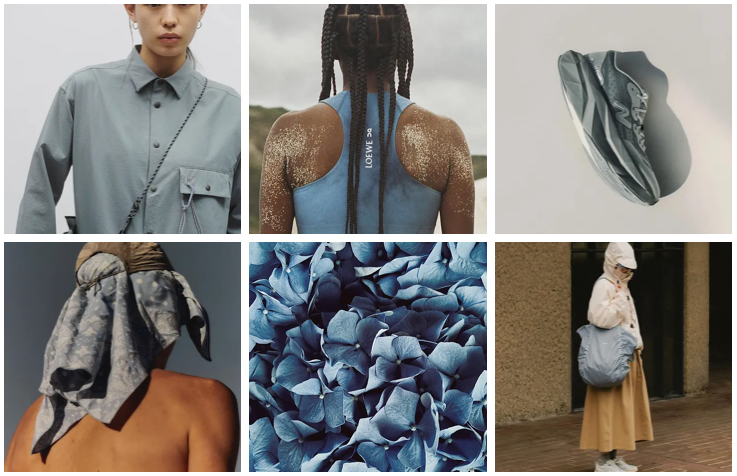
The greens are inspired by nature - herbs and woodsy vegetation, minerals and tender new growth. Towards the lighter side, some of the greens have a scientific essence; clear and clean, refreshing.
clockwise: Kamran Abdullayev, Hylo Athletics, Sabah, Pas Normal Studios, Pangaia, Annie Spratt
Warm hues tend to be pinks and terracottas. In the last few years, soft pink has become almost a neutral. It creates a welcoming sense of gentleness and luxury. Terracottas are lovely for their gender inclusivity, their immediate association with earth, clay, and rock, and how they expand the warmth of the neutrals into a more definitive color space.
clockwise: Laurice Manaligod, Farrow & Ball, Olesia Bahrii, Bala, Stephanie Harvey, Everlane
Factors Driving this Trend
Two main drivers are influencing this trend - 1) the growing shift towards less consumption and 2) the response to the continued, compounded feelings of overwhelm.
#1: Less Consumption
People are becoming more conscientious about their consumption. There is a rising, pervasive understanding of how unchecked consumerism has contributed to the climate crisis. Armed with this knowledge, people are thoughtfully evaluating their lifestyles, and making fewer, more sustainable and considered purchases, or sometimes, no purchases at all. Interest in handcrafted, homegrown, repairing, buying second hand, and repurposing has soared. More attention and dollars are being invested into materials and processes that are regenerative, harmonious with nature, and have a lower/no environmental footprint.
In addition to environmental factors, people are also buying less because of financial concerns. These concerns include inflation, stagnant wages, high debt levels, high interest rates, economic unpredictability, and the rising costs of housing, healthcare, and childcare. Many feel anxious and uncertain about their financial situation. This directly impacts the quantity and type of purchases they are willing to make. The necessity and value - both practical and emotional - becomes highly scrutinized.
This leads people to prefer neutrals and quiet colors because of their long-term relevance and appeal. Also, these hues are widely associated with sustainability which contributes to their popularity.
#2: Response to Overwhelm
The second big driver contributing to trending neutrals and quiet colors is a sense of overwhelm and the proactive response to counteract this feeling. The stress and anxiety that skyrocketed during the pandemic continues to remain an undercurrent today. While cautious optimism, perseverance, and positive indicators have eroded some of the extreme feelings of dread, many still feel swamped by the burden and drain of everyday life.
In response, people are more vocal and firm about their boundaries and priorities. Designing a life aligned with personal values and passions is the North Star. Mental health - more accurately, whole being health - has become a guiding principle in life decisions. Despite the ability to be ever-connected, people are creating separations, on their own terms, between work, social obligations, recreation, solitude, family, and community. Rest has been elevated to the non-negotiable that it is.
As a result, people are seeking and creating nourishing, restorative, peaceful spaces, products, and experiences. They balance the uncontrollable clamor of their lives with nurturing, personalized environments and practices. Already zapped from the noisy chaos of daily life, they look for low visual and auditory noise. This increases the preference for quiet colors and neutrals, as these hues make us feel more relaxed and calm. Their subdued nature serves as a buffer from the hubbub of routine life.
How are you able to incorporate these color trends into your brand?
Pangaia